Project 3: Understanding Ridesharing Demands in New York City
1. Overview
In this project, we will focus on New York City’s Ridesharing Trips Data Set and try to answer three interesting questions:
(1) How do the residents of New York City use Ridesharing?
(2) What usage patterns can we see?
(3) Can we predict usage?
To answer these questions, first we will clean up the trip data and integrate them with weather data and taxi zone geodata. Then we will conduct Exploratory Data Analysis (EDA) and Statistical Tests to find Temporal and Spatial Patterns, as well as weather effects and tipping behaviors. After that, we will develop a clustering model to gain a better understanding of how ridesharing is being used. Finally we will develop four machine learning models to predict rideshare utilization, including Seasonal Autoregressive Integrated Moving Average (SARIMA), Gaussian Process (GP), Vector Autoregression (VAR), and Recurrent Neural Network (RNN).
The Python Notebook containing the complete model development process and the data used in this project can be found at Google Drive.
2. Data cleaning, wrangling, and enhancement
The ride-sharing vehicles in New York City are regulated by the Taxi & Limousine Commission (TLC), and the trip record data since 2009 can be downloaded from the TLC Data Portal. The dataset contains basic information about each ride, including: pickup and drop off time and location, whether trips are pooled, and information about fares and tips. To protect privacy, the trips data are anonymized, so pickup and drop off locations are generalized to the nearest taxi zones, no customer data is available, and drivers can not be linked to particular rides they provided.
The trip record of each month was downloaded as a PARQUET file from the TLC Data Portal.The data preprocessing steps performed include:
- Removing rides with zero distance or zero fare;
- Creating datetime fields with the ride start and end datetimes rounded to the nearest hour; and
- Aggregating the dataset by hour and taxi zone and calculating trip counts, average fare, average distance, and average duration
Since the dataset is very large (around 15 million trip records for each month), in addition to the wrangling steps above, I have also sampled 10% of individual trip records for Exploratory Data Analysis (EDA).
In order to enrich the rideshare dataset, I merged in additional data sources that many enhance understanding and prediction of trip demands. A weather dataset from NOAA LaGuardia Airport station containing hourly and daily aggregated measurements of temperature, wind, and precipitation was merged with the Trips data by matching on the ride pickup datetime field. Taxi Zone boundary geojason file was also downloaded from the NYC OpenData and loaded into geodataframes using the geopandas python library.
3. EDA and statistical analysis
In this section, we will conduct Exploratory Data Analysis (EDA) and Statistical Analysis to identify interesting temporal patterns, spatial patterns, spatiotemporal patterns. We will also investigate effects of weather (e.g., temperature and precipitation) on rideshare usage as well as rider’s tipping behavior. An excellent example of Exploratory Data Analysis (EDA) can be found here.
3.1. EDA findings: Temporal pattern
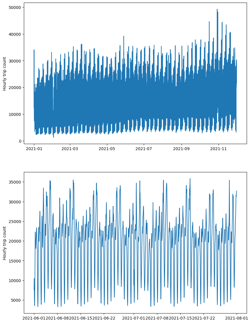
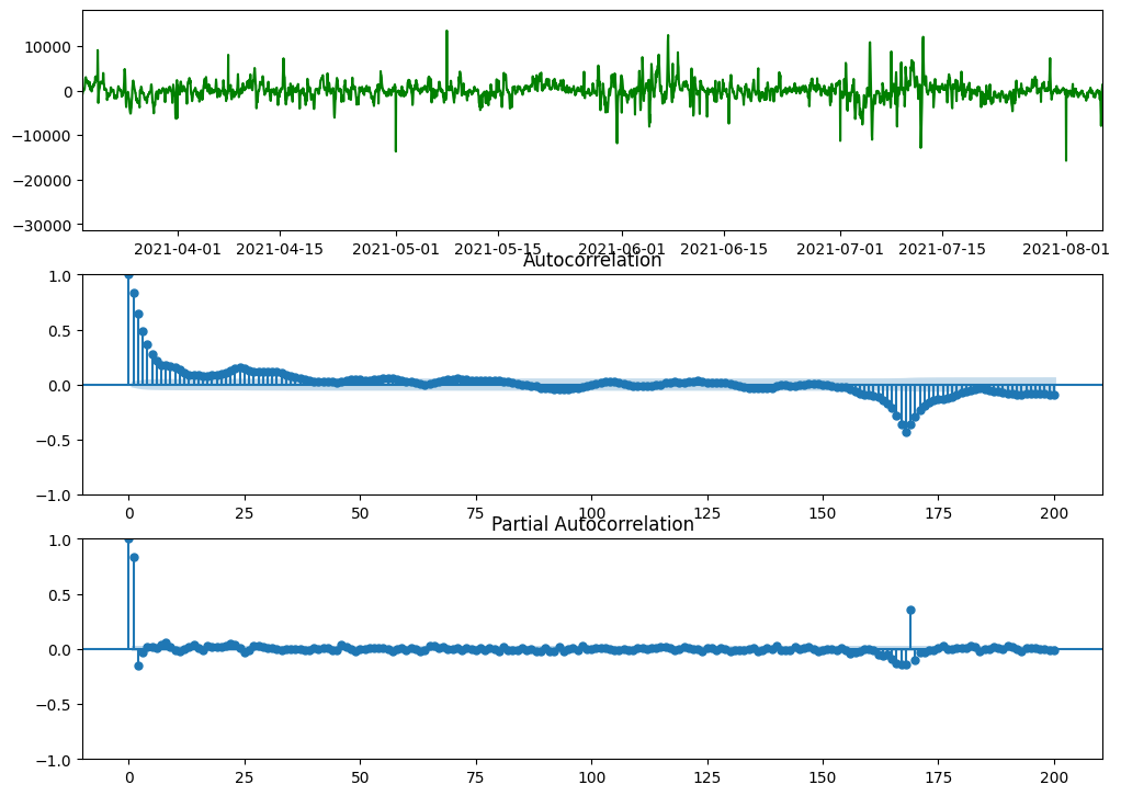
In the figure below, we plotted the systemwide hourly rideshare usage as a function of time over the entire data period. From this figure, we find that rideshare usage is cyclical, with a usage pattern demonstrating both hourly and weekly components.
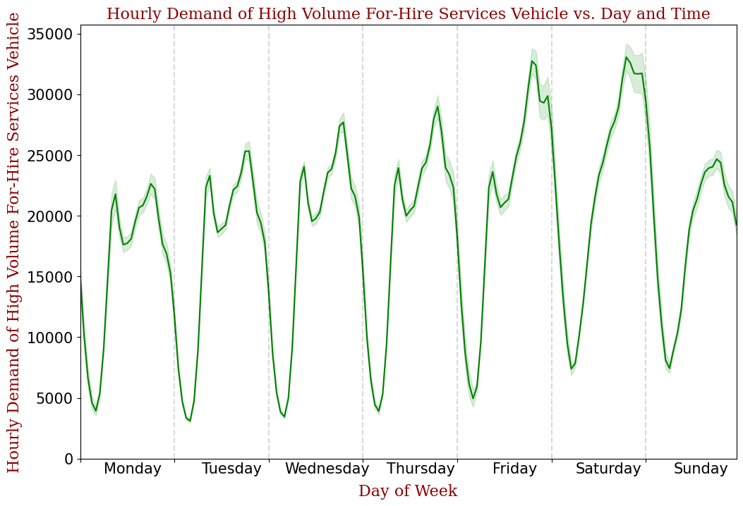
The cyclical pattern is further shown below by plotting the hourly demand vs. day and time. From this figure, we notice that during weekdays, there are two peaks, one for morning rush hour and the other for evening rush hour. During weekends, there is only one demand peak in the late evening.
3.2. EDA findings: Spatial pattern
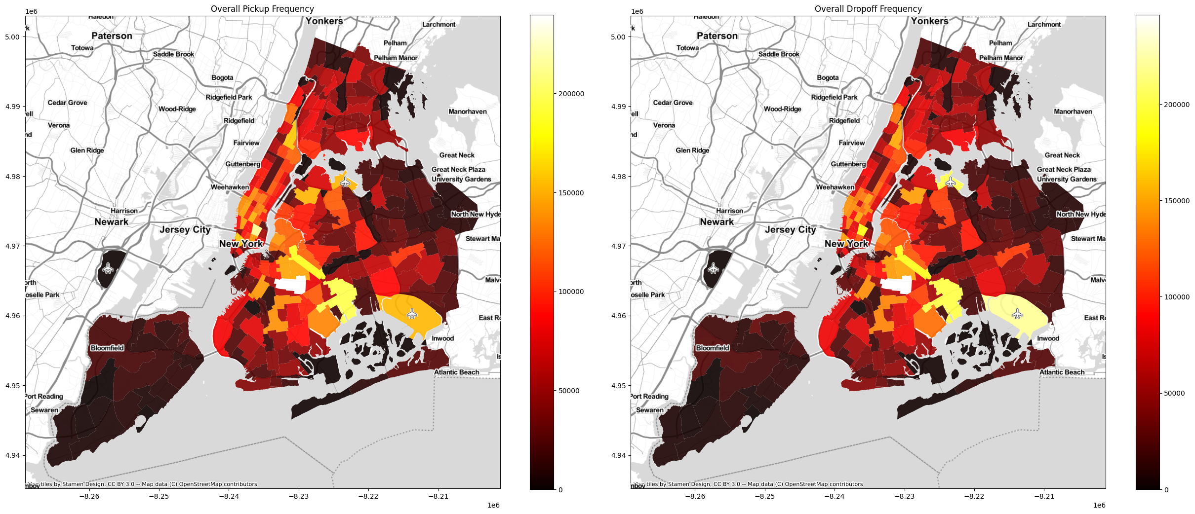
The highest rideshare usage occurs in Crown Heights, where several subway stations connecting Brooklyn with Manhattan. Downtown core (e.g., East Village) and airports (e.g., JFK and LGA) also have very high rideshare usage. Away from these areas, the rideshare usage drops of quickly. The following choropleth map, which displays the sum of total pickups and drop offs by taxi zone, illustrates this pattern clearly.
3.3. EDA findings: Spatiotemporal patterns
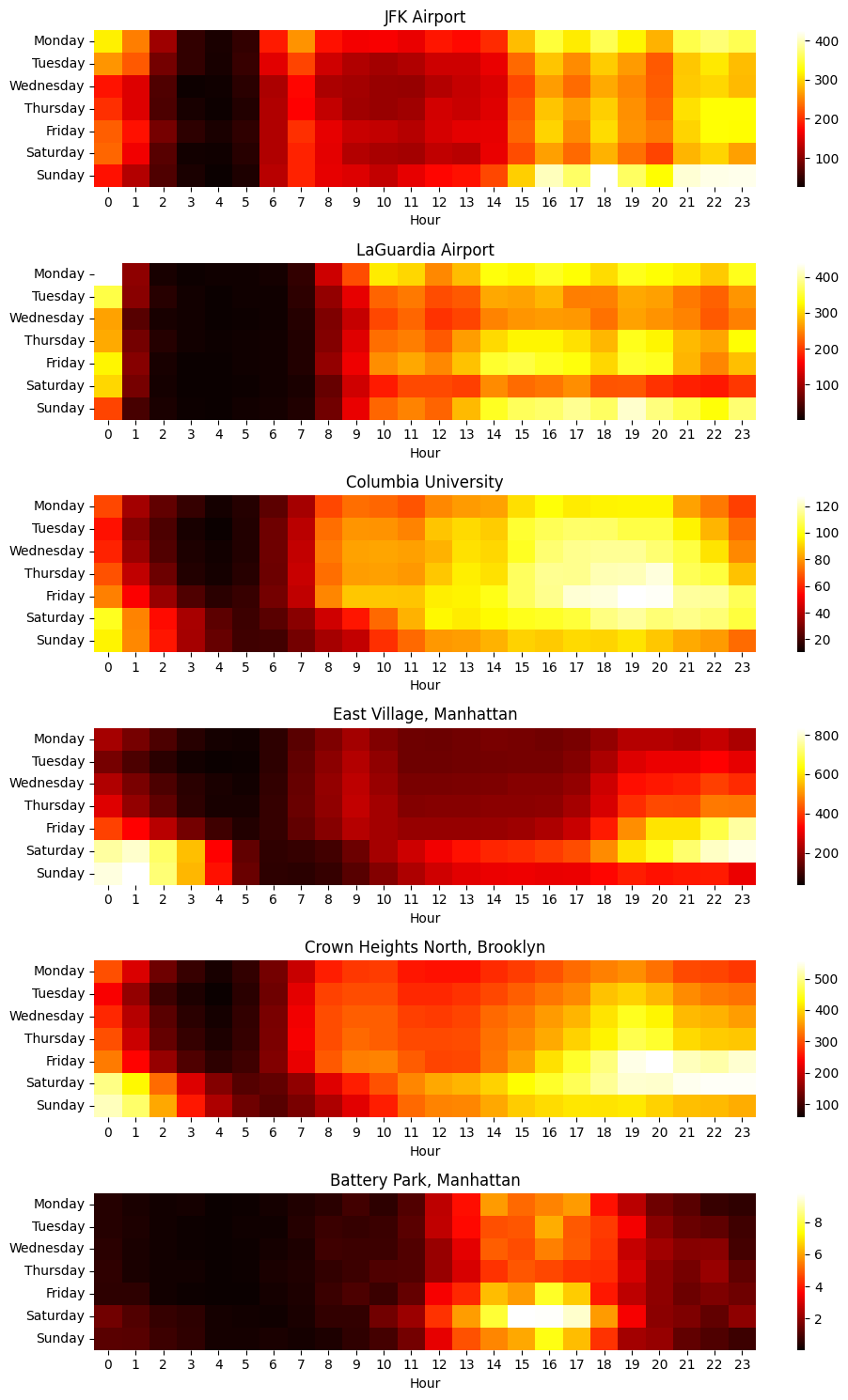
Rideshare usage patterns vary across the city. The data demonstrates distinct patterns for airports, downtown, residential neighborhoods, etc. The following heatmap shows usage patterns for a few areas within the city, and show distinct variations between airports, downtown, neighborhood and park.
3.4. EDA findings: Weather effects
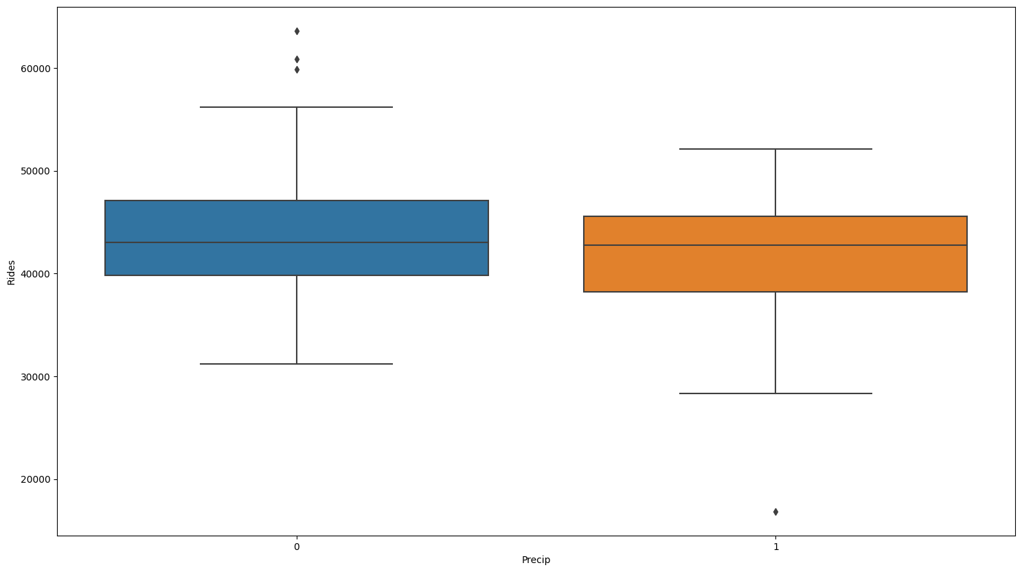
The relationship between rideshare usage patterns and weather is not obvious. When viewed at the daily level, rideshare utilization patterns do not appear sensitive to either temperature or precipitation.
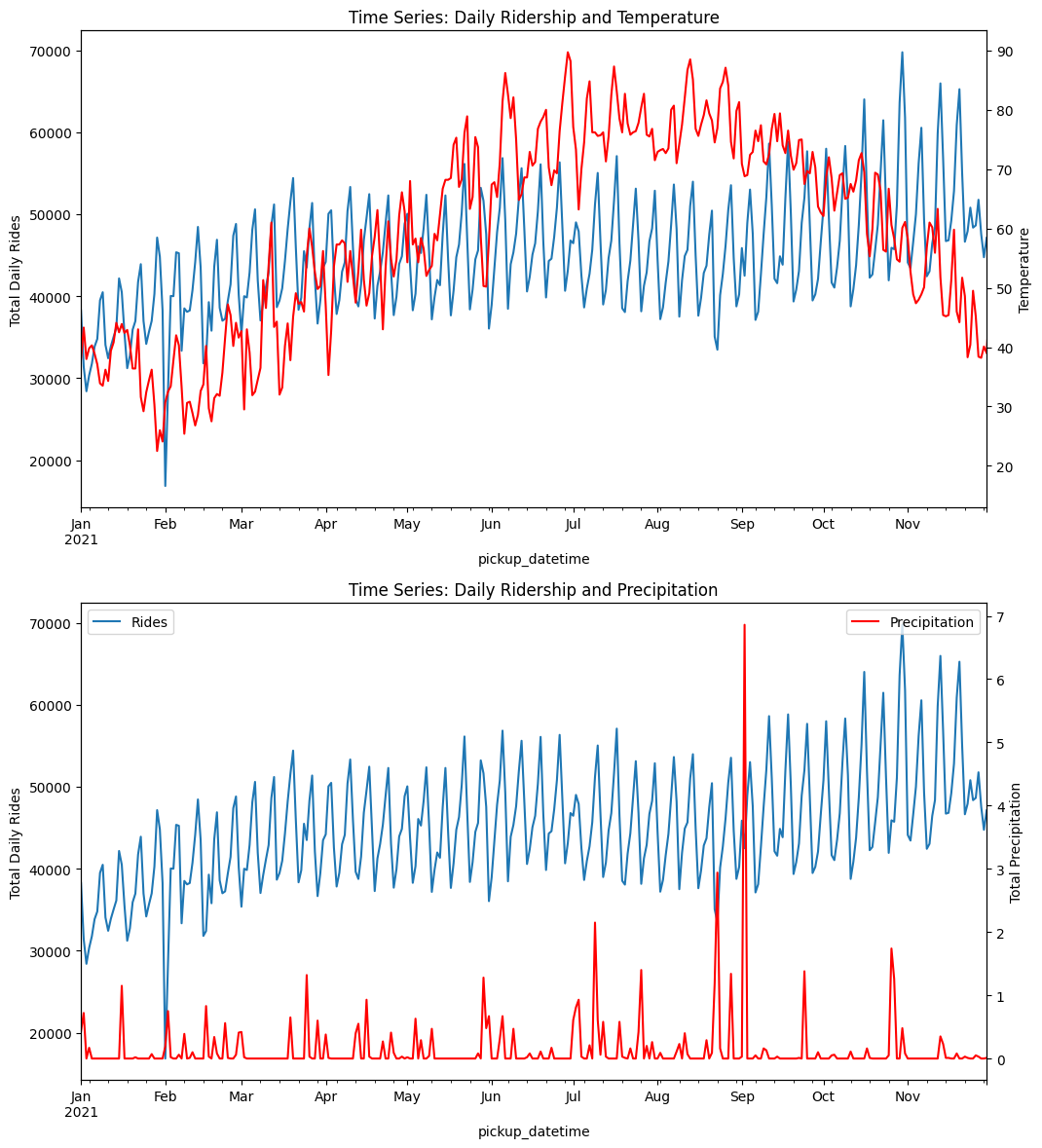
When we zoom to the hourly level, there appears to be no statistical relationship between rideshare usage and precipitation, and the rideshare usage only decreases lightly.
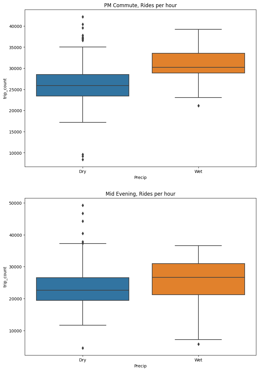
If we isolate a more specific time window (e.g., PM commute and Mid evening), we can isolate small effects such as shown below, with utilization increasing during PM commute period and mid evening.
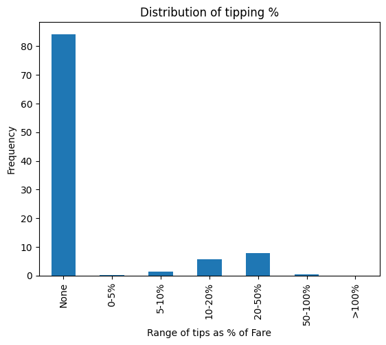
3.5. EDA findings: Tipping
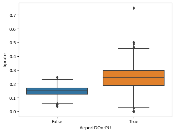
From the figure below, we can find that riders tip the driver on approximately 15% of rides, and that for those who tip the driver, the tips are typically 20–50% of the fare.
Factors influencing the likelihood of a tip include whether the ride originates or ends at the airport. A two-sample z-test of the proportion of tipped rides between airport/non-airport rides demonstrated a statistically significant increase in the odds of tipping for airport pickups.
# Two sample Z-test for difference between sample proportions
# CLT applies if np and n(1-p) are both >5
# H0:  p_air = p_other
# Alpha = 0.05 --> Z = +/- 1.96
p_all = tipsdf['NumTippedRides'].sum()/tipsdf['NumRides'].sum()
p_all

n_other=tipsdf.loc[False,'NumRides']
n_air=tipsdf.loc[True,'NumRides']
p_other=tipsdf.loc[False,'PropTips']
p_air=tipsdf.loc[True,'PropTips']

sem =p_all*(1-p_all)*(1/n_other + 1/n_air) #n is big, this value becomes very small
Z = (p_air-p_other)/np.sqrt(sem) #SEM is small, so Z gets very large
print('Z-score: {:0.0f}'.format(Z))
# Z-score: 256
#This is a high z-score
#Reject H0, conclude the odds of getting a tip are higher for airport pickups
The following box plot, which shows the percentage of tipped rides (AirportDOorPU=True indicates the trip’s Pickup location or Drop off location is an airport), illustrates this effect.
4. Clustering analysis
In this section, a clustering model was developed to gain a better understanding of how ridesharing is being used in New York City. For this analysis, the rides data were grouped on the following fields:
- Taxi zone of Pickup;
- Taxi zone of Drop off;
- Period within the day: early morning (11 p.m.–5 a.m.), morning (5 a.m.–9 a.m.), midday (9 a.m.–1 p.m.), afternoon (1 p.m.–4 p.m.), evening (4 p.m.–7 p.m.), and late evening (7 p.m.–11 p.m.);
- whether the ride occurred on a weekend or weekday;
- whether the ride involved the airport as Pickup or Drop off.
The timing of each trip was also simplified into larger buckets (weekend/weekday, period of day) to improve interpretability of outcomes. A boolean airport flag was added since this attribute was found during EDA to have a strong influence on rideshare utilization. Holidays were excluded from the analysis. Within each grouping, the following aggregated values were calculated: number of rides, average ride duration, average ride distance, and average fare.
To prepare the data for fitting a clustering model, the grouped dataset was pivoted to create columns containing ride counts for each grouping of weekend/weekday and day period. After this reworking, the final dataset contained a single record for each route, each with a MultiIndex containing the unique combinations of drop off and pickup Community Areas, and columns containing the ride count columns, the airport flag, and the average fare for the route.
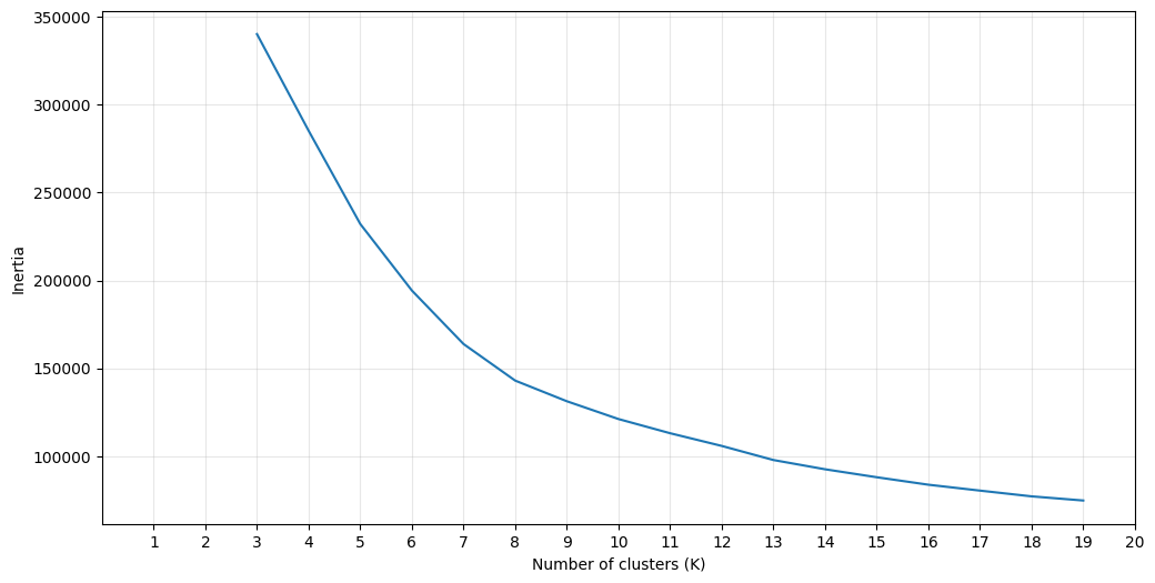
The KMeans clustering algorithm was selected for this analysis. This model requires the user to specify the number of clusters k before fitting the model. To determine an appropriate value of k, the inertia (within-cluster sum of squares) was calculated for values of k between 2 and 19.
The silhouette score and associated plots were generated for a variety of values of k. The results shown below suggested a plateau in the silhouette score above k=7. This is also in consistency with thea small elbow near k=7 shown in the second figure below.
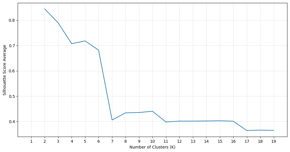
In this study, the KMeans model was fit to the dataset using a variety of k values. The data was scaled prior to input to the algorithm. The result at k=7 showed interesting patterns and will be used for the interpretation of results shown below.
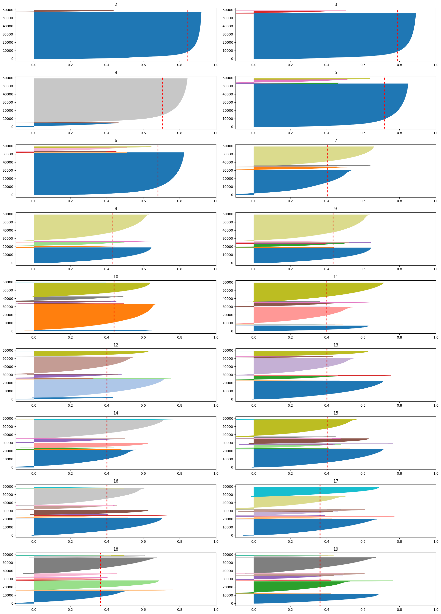
A dashboard was built using IPywidgets to facilitate the evaluation of results. The dashboard has a single widget, for selection of the cluster, and outputs visualizations of the routes, distribution of fares, and temporal utilization patterns associated with each cluster. As an example, clustering results of clusters 2, 4 and 5, are shown below:
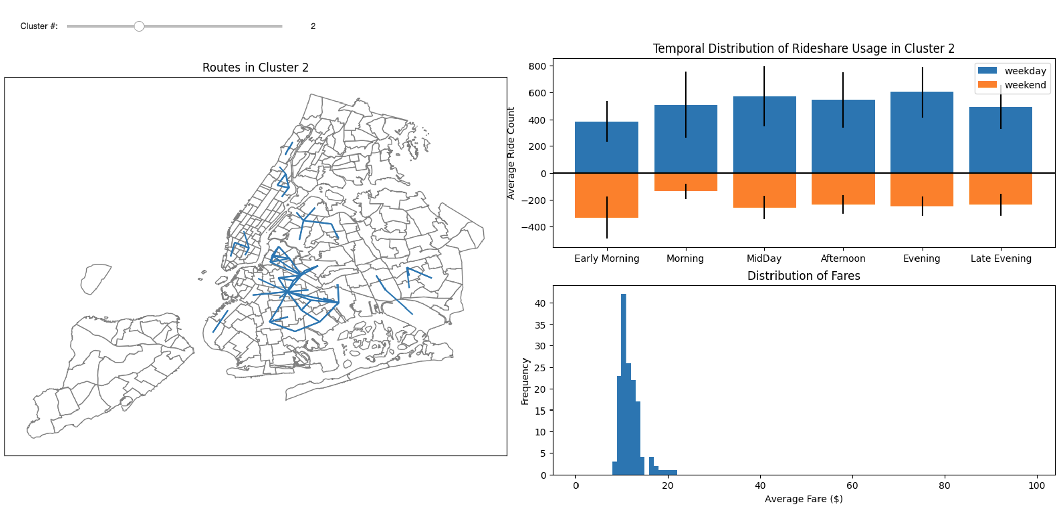
The figure below is for cluster 2, which shows strong commuting patterns in Crown Heights where riders take subway to or from Manhattan. Another strong pattern near the downtown area (East Village) is also shown in this figure. These routes all represent groups of rides with relatively low fares.
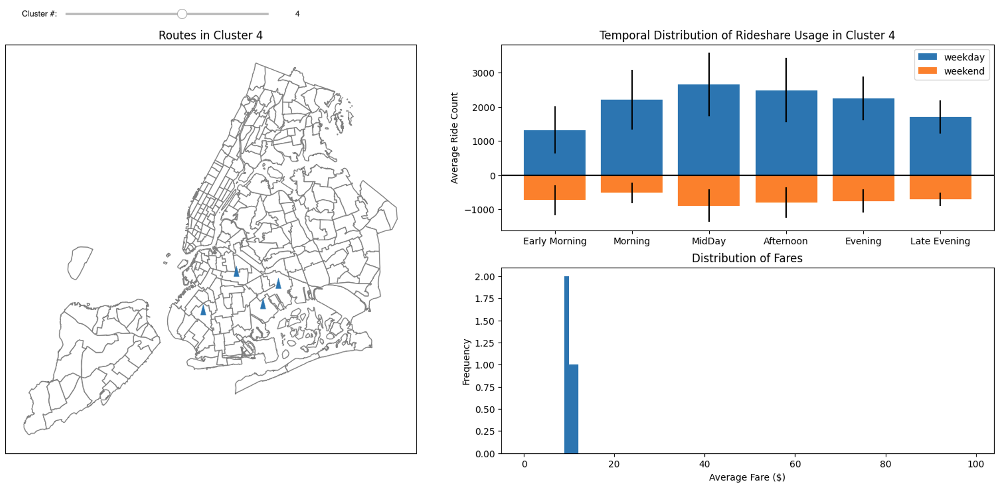
The figure below is for cluster 4, which shows short distance ride with pickup location and drop off location in the same taxi zone. These rides mainly occurs during midday and afternoon, and the average fare is close to the Minimum Fare.
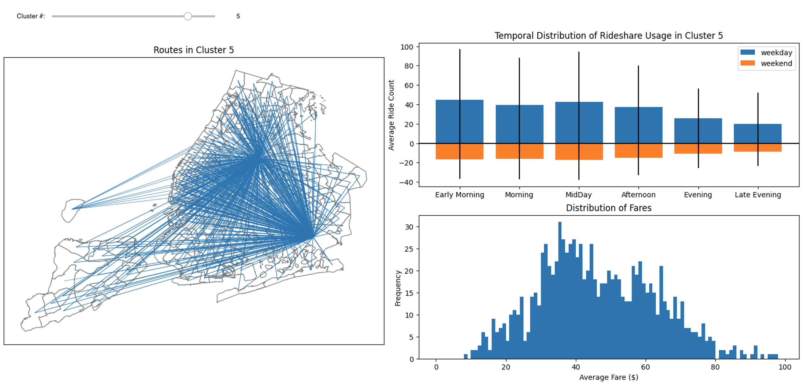
Cluster 5 was identified with airport pickups and is shown in the figure below. This cluster demonstrates a weekday early morning peak, and a wide distribution of fares.
5. Rideshare usage prediction
In this section, we will develop four models to predict the rideshare usage. In particular, the systemwide hourly rideshare usage will be predicted by two univariate time series models: Seasonal Autoregressive Integrated Moving Average (SARIMA), and Gaussian Process (GP).
5.1. Seasonal Autoregressive Integrated Moving Average (SARIMA)
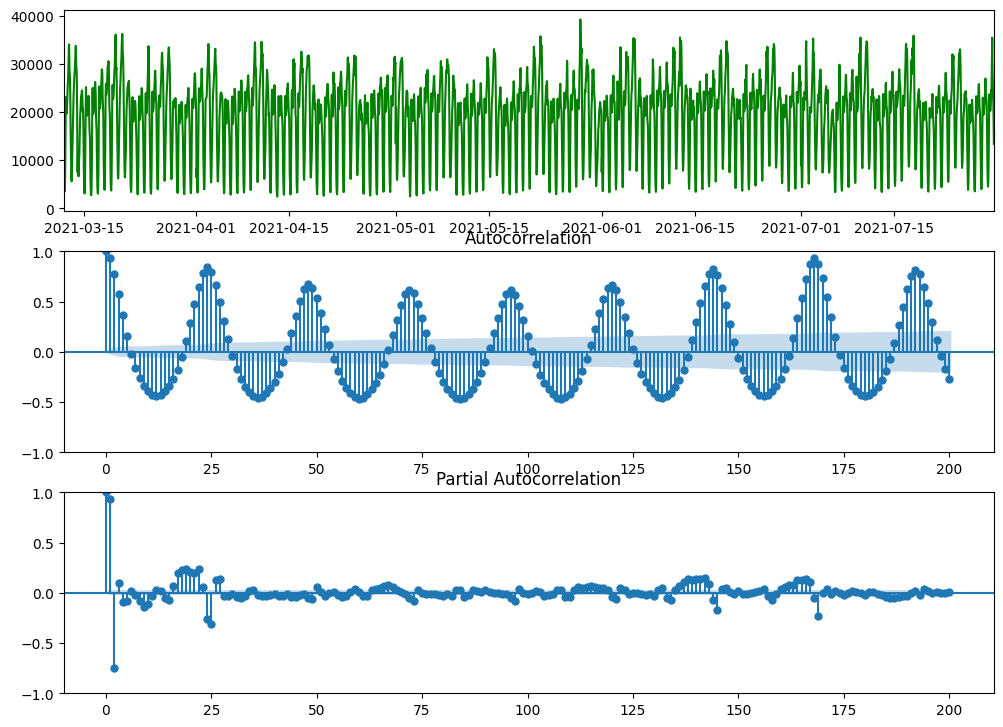
In the figure above, systemwide hourly rideshare demands of 20 weeks starting from March 12 is shown. We choose this time window for Seasonal Autoregressive Integrated Moving Average (SARIMA) model because it better satisfies the stationarity requirement. From the figures above, we can find that: (1) the data has seasonality of 168 hours (i.e., a week); (2) there is no obvious trend in data (will test later using Augmented Dickey–Fuller test); and (3) There is no obvious change in the variance of data, so we do not need to take log transform of data. In the code box below, we will conduct seasonal differencing of data and then take Augmented Dickey–Fuller test:
df_D_168 = df.diff(periods=168).dropna()
df_D_168_adf = adfuller(df_D_168)
print("1. ADF : ",df_D_168_adf[0])
print("2. P-Value : ", df_D_168_adf[1])
print("3. Num Of Lags : ", df_D_168_adf[2])
print("4. Num Of Observations Used For ADF Regression and Critical Values Calculation :", df_D_168_adf[3])
print("5. Critical Values :")
for key, val in df_D_168_adf[4].items():
    print("\t",key, ": ", val)

# Output:
1. ADF :  -10.148423918150554
2. P-Value :  8.070162297528182e-18
3. Num Of Lags :  28
4. Num Of Observations Used For ADF Regression and Critical Values Calculation : 6355
5. Critical Values :
	 1% :  -3.431379416735103
	 5% :  -2.8619949122326487
	 10% :  -2.5670121466584046
From the figure above and the Augmented Dickey–Fuller (adfuller) test above, we can find that the data has stationarity and trend-stationarity (p-value is very small, 8.07e-18, so we will reject the null hypothesis and accept the alternative hypothesis). So for Seasonal ARIMA model SARIMA(P, D, Q, p, d, q)_s, we will set D = 1, d = 0, and s = 168.
As Parsimony principle suggests, we will keep P + D + Q + p + d + q <= 6. Since D = 1 and d = 0, we can have P + Q + p + q <=5.
From the Autocorrelation plot, we can find there are quite a few closer spikes, so the potential values of Moving Average (MA) order q could be q = 0/1/2/3/4/5.
Also from the Autocorrelation plot, we can find spikes around seasonal lags of 168 hours, so the potential values of the Seasonal Moving Average (SMA) order Q could be Q = 0/1.
Similarly from the Partial Autocorrelation plot, we can find there are 2 closer spikes, so the potential values of Autoregressive (AR) order p could be p = 0/1/2.
Also from the Partial Autocorrelation plot, we can find spikes around seasonal lags of 168 hours, so the potential values of the Seasonal Autoregressive (SAR) order P could be P = 0/1.
In summary by analyzing the plots above, we have the following potential orders as shown below. Also we need to satisfy P + Q + p + q <=5 to follow the Parsimony principle: (1) P = 0/1, (2) Q = 0/1, (3) p = 0/1/2, (4) q = 0/1/2/3/4/5.
During the development of SARIMA model, we have fit few different models and compare their Akaike Information Criteria (AIC).
===================================================================
P	D	Q	s	p	d	q	AIC	        Ljung-Box (L1) (Q)	Prob(Q)
===================================================================
0	1	0	168	0	0	0	26695.77	838.9	            0.00
0	1	0	168	0	0	1	25965.16	108.9	            0.00
0	1	0	168	0	0	2	25721.78	18.9	            0.00
0	1	0	168	0	0	3	25638.62	4.7	                0.03
0	1	0	168	0	0	4	25603.19	1.9	                0.17
0	1	0	168	0	0	5	25587.32	1.3	                0.26
-------------------------------------------------------------------
0	1	0	168	1	0	0	25579.33	1.1	                0.30
0	1	0	168	1	0	1	25582.59	0.3	                0.59
0	1	0	168	1	0	2	25581.56	0.4	                0.54
0	1	0	168	1	0	3	25581.98	0.4	                0.53
0	1	0	168	1	0	4	25580.28	0.4	                0.52
-------------------------------------------------------------------
0	1	0	168	2	0	0	25582.62	0.2	                0.63
0	1	0	168	2	0	1	25573.31	0.2	                0.69
0	1	0	168	2	0	2	25570.94	0.6	                0.45
0	1	0	168	2	0	3	25585.27	0.4	                0.55
-------------------------------------------------------------------
0	1	1	168	0	0	0	26707.22	848.0	            0.00
0	1	1	168	0	0	1	25994.98	116.6	            0.00
0	1	1	168	0	0	2	25736.47	23.1	            0.00
0	1	1	168	0	0	3	25604.12	6.6	                0.01
0	1	1	168	0	0	4	25567.29	3.1	                0.08
-------------------------------------------------------------------
0	1	1	168	1	0	0	25505.32	0.0	                0.84
0	1	1	168	1	0	1	25507.31	0.1	                0.77
0	1	1	168	1	0	2	25508.33	0.1	                0.72
0	1	1	168	1	0	3	25509.29	0.2	                0.69
-------------------------------------------------------------------
0	1	1	168	2	0	0	25507.30	0.1	                0.76
0	1	1	168	2	0	1	25509.31	0.1	                0.78
0	1	1	168	2	0	2	25542.66	0.1	                0.74
-------------------------------------------------------------------
1	1	0	168	0	0	0	26754.48	847.6	            0.00
1	1	0	168	0	0	1	25953.17	116.4	            0.00
1	1	0	168	0	0	2	25699.62	22.4	            0.00
1	1	0	168	0	0	3	25608.02	6.4	                0.01
1	1	0	168	0	0	4	25571.81	3.0	                0.08
-------------------------------------------------------------------
1	1	0	168	1	0	0	25517.75	0.3	                0.57
1	1	0	168	1	0	1	25519.73	0.2	                0.64
1	1	0	168	1	0	2	25520.22	0.3	                0.59
1	1	0	168	1	0	3	25520.97	0.3	                0.57
-------------------------------------------------------------------
1	1	0	168	2	0	0	25519.73	0.2	                0.64
1	1	0	168	2	0	1	25518.62	0.1	                0.75
1	1	0	168	2	0	2	25522.84	0.3	                0.61
-------------------------------------------------------------------
1	1	1	168	0	0	0	26715.96	846.3	            0.00
1	1	1	168	0	0	1	25936.52	114.5	            0.00
1	1	1	168	0	0	2	25683.84	21.4	            0.00
1	1	1	168	0	0	3	25592.39	5.7	                0.02
-------------------------------------------------------------------
1	1	1	168	1	0	0	25496.02	0.0	                0.99
1	1	1	168	1	0	1	25498.01	0.0	                0.93
1	1	1	168	1	0	2	25499.19	0.0	                0.87
-------------------------------------------------------------------
1	1	1	168	2	0	0	25497.98	0.0	                0.92
1	1	1	168	2	0	1	25500.02	0.0	                0.94
===================================================================
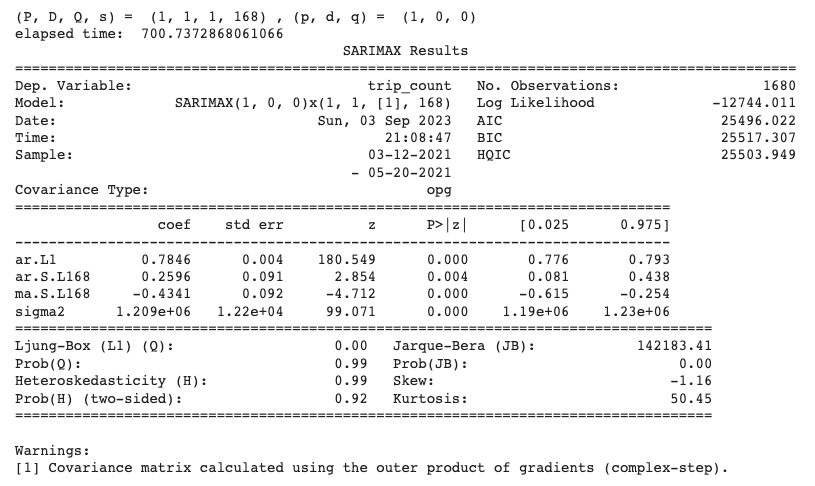
As shown above, we find that the model SARIMA(P=1, D=1, Q=1, s=168, p=1, d=0, q=0) has the lowest AIC value and will be selected as our model.
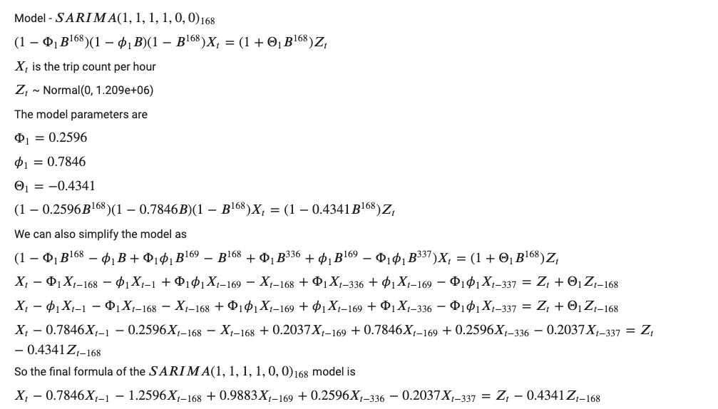
seasonal_order = (1, 1, 1, 168)
order = (1, 0, 0)
print('(P, D, Q, s) = ', seasonal_order, ', (p, d, q) = ', order)
start_time = time.time()
model=sm.tsa.SARIMAX(endog=df[1680:3360], order=order, seasonal_order=seasonal_order)
model_fit = model.fit(disp=False)
elapsed_time = time.time() - start_time
print('elapsed time: ', elapsed_time)
print(model_fit.summary())
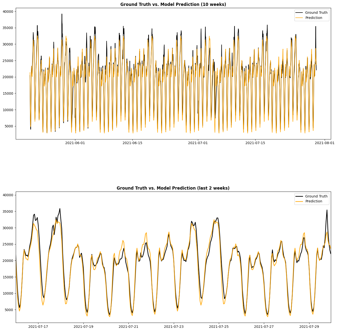
The figure below shows the prediction from the SARIMA(P=1, D=1, Q=1, s=168, p=1, d=0, q=0) that we developed above. From this figure, we can see that SARIMA model gives pretty accurate prediction, and it can successfully capture the hourly and weekly components. Also, since the Ljung-Box test has Q = 0.00 and Prob(Q) = 0.99, we can accept the null hypothesis of the test and conclude that the residuals are independent.
5.2. Gaussian Process (GP)
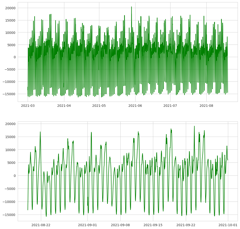
From the figure of systemwide rideshare demand shown in Section 3.1., we can observe that there is a lower trip count near the beginning of February 2021, and that there is a higher trip count near the end of October. To ensure data consistency and (weak) stationary, we will focus on data between Mar 1 and Sep 30 in this study.
Since the length of the dataset is 5136, We will use 80% (5136 * 0.8 = 4109) as training set, and 20% (5136 - 4109 = 1027) for test. The figure below shows the training and test data after subtracting the mean from the training data.
y_mean = df_train['trip_count'].mean()
print(y_mean)
df_train['trip_count'] = df_train['trip_count'] - y_mean
df_test['trip_count'] = df_test['trip_count'] - y_mean
Designing proper kernel is crucial for Gaussian Process. To design the kernel to use with our Gaussian process, we can make some assumption regarding the data at hand. We observe that they have several characteristics, and we can use different appropriate kernel that would capture these features.
- a pronounced daily variation,
- a pronounced weekly variation,
- some smaller irregularities and white noise
The daily variation is explained by the periodic exponential sine squared kernel with a fixed periodicity of 24 hour or 1 day. The length-scale of this periodic component, controlling its smoothness, is a free parameter. In order to allow decaying away from exact periodicity, the product with an RBF kernel is taken. The length-scale of this RBF component controls the decay time and is a further free parameter. This type of kernel is also known as locally periodic kernel.
# periodic range : 0.5 --2 days
k1 = ConstantKernel(constant_value=1) * ExpSineSquared(length_scale=1.0, periodicity=24.0, periodicity_bounds=(10, 50))
Similarly, the weekly variation is explained by the periodic exponential sine squared kernel with a fixed periodicity of 168 hour or 7 days. The length-scale of this periodic component, controlling its smoothness, is a free parameter. In order to allow decaying away from exact periodicity, the product with an RBF kernel is taken. The length-scale of this RBF component controls the decay time and is a further free parameter. This type of kernel is also known as locally periodic kernel.
# periodic range : 1 --2 weeks
k2 = ConstantKernel(constant_value=1) * ExpSineSquared(length_scale=1.0, periodicity=168.0, periodicity_bounds=(150, 350))
Finally, the noise in the dataset can be accounted with a kernel consisting of an RBF kernel contribution, which shall explain the correlated noise components such as local weather phenomena, and a white kernel contribution for the white noise. The relative amplitudes and the RBF’s length scale are further free parameters.
# k4 = ConstantKernel(constant_value=0.1) * RBF(length_scale=0.1) + WhiteKernel(noise_level=0.1**2, noise_level_bounds=(1e-5, 1))
k4 = WhiteKernel(noise_level=0.3**2)
Thus, our final kernel is an addition of all previous kernel, and we are ready to use a Gaussian process regressor and fit the available data.
kernel_1  = k1 + k2 + k4
gp1 = GaussianProcessRegressor(kernel=kernel_1, n_restarts_optimizer=3, normalize_y=True)
gp1.fit(X_train, y_train)
gp1.kernel_
# Output
1.25**2 * ExpSineSquared(length_scale=0.662, periodicity=24) +
1.35**2 * ExpSineSquared(length_scale=0.113, periodicity=168) +
WhiteKernel(noise_level=0.0354)
To generate predictions and evaluate the model, first we will scale back the data to our original scale. Then, to check the performance, we will plot the original and predicted time series plot, as shown below. From this figure, we can see that for both the training set and test set, the Gaussian Process model developed in this work can provide accurate prediction, capturing both the daily and weekly patterns.
y_pred, y_std = gp1.predict(X, return_std=True)
data_df['y_pred'] = y_pred + y_mean
data_df['y_std'] = y_std
data_df['y_pred_lwr'] = data_df['y_pred'] - 2*data_df['y_std']
data_df['y_pred_upr'] = data_df['y_pred'] + 2*data_df['y_std']
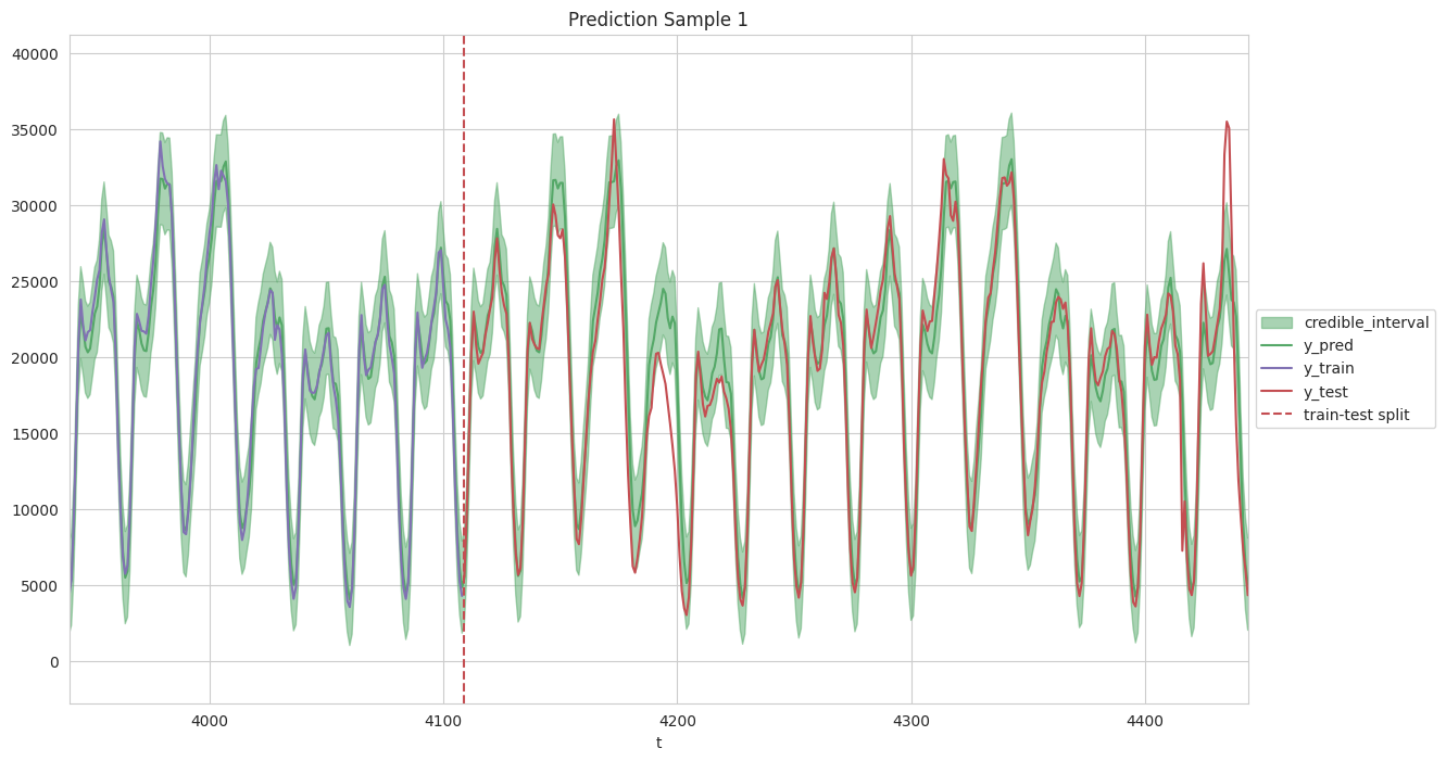
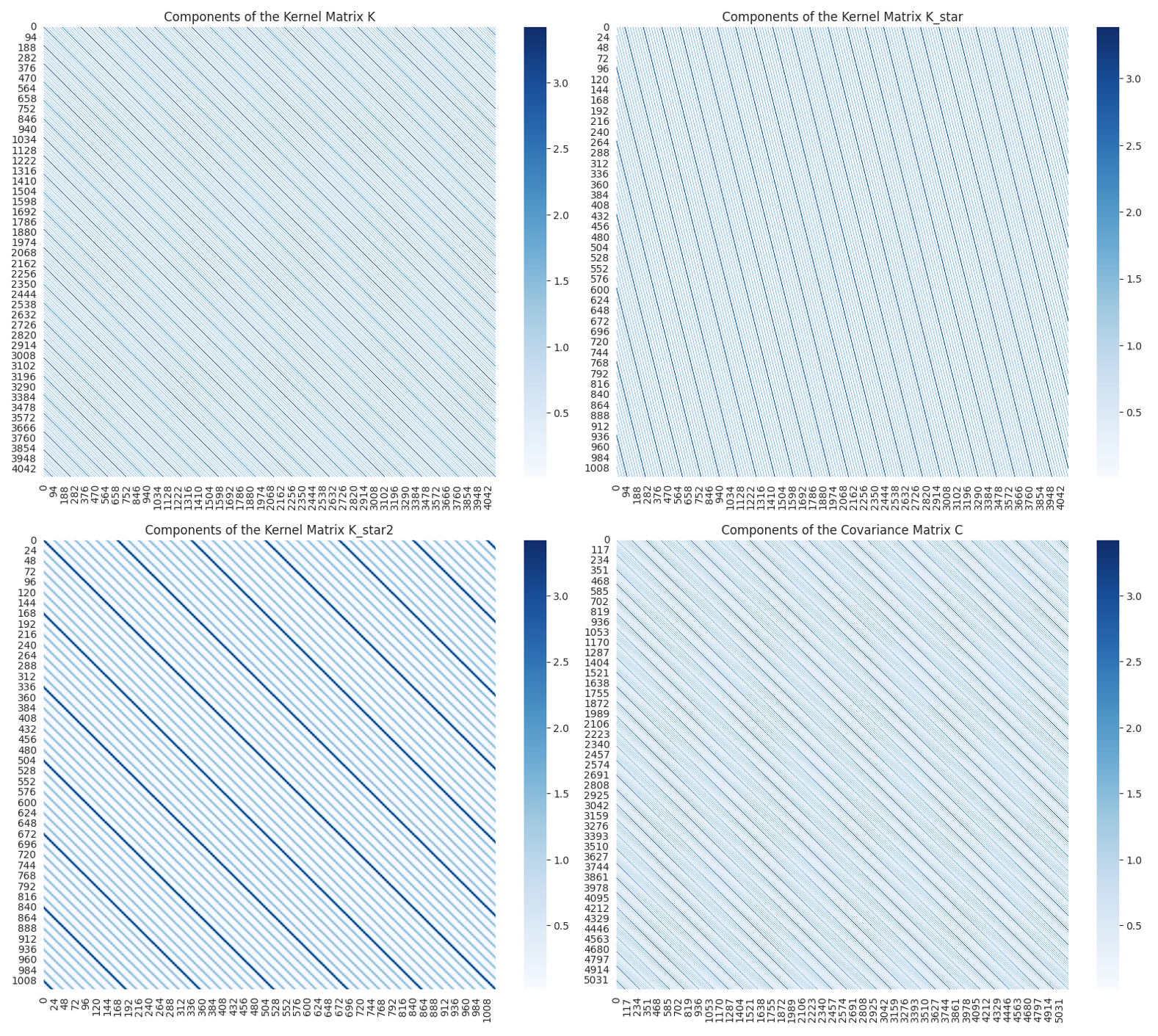
Finally, we computed the Covariance Matrices and the results are shown below. A great reference is here. We employ the following notation: K = K(X, X), K_star = K(X*, X), and K_star2 = K(X*, X*). From the figure below, we observe that (1) Covariance Matrices is symmetric; (2) strong effects of 24 hours (i.e., daily cyclic trend) and 168 hours (i.e., weekly cyclic trend) are observed. These observations are as expected and in very good agreement with the data.
5.3. Vector Autoregression (VAR)
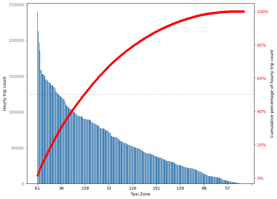
There are 263 taxi zones in New York city, the 61 taxi zones with highest rideshare usage only take 23% of taxi zones and contribute more than 50% of rideshare usage. These 61 taxi zones with highest rideshare usage will be predicted by the two multivariate time series models studied in this work, including Vector Autoregression (VAR) in this section and Recurrent Neural Network (RNN) in the next section.
Similar to the SARIMA model in Section 5.1., hourly rideshare demands of 20 weeks starting from March 12 will be used. We choose this time window for Vector Autoregression (VAR) model because it better satisfies the stationarity requirement. One key difference is that in Section 5.1., the SARIMA model is an univariate time series model which will predict the systemwide total rideshare demand; while the VAR model developed in this section is a multivariate time series model which will predict the rideshare demand of 61 taxi zones simultaneously.
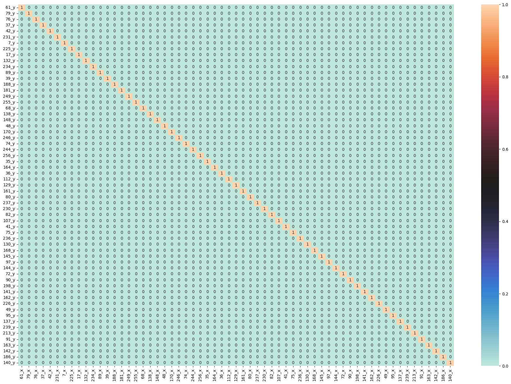
The first step of developing VAR model is to check Granger Causality of all possible combinations of the Time series Ref. The values in the figure below are the P-Values. P-Values lesser than the significance level (0.05), implies the Null Hypothesis that the coefficients of the corresponding past values is zero, that is, the X does not cause Y can be rejected. Looking at the P-Values in the figure below, we can pretty much observe that all the variables (time series) in the system are interchangeably causing each other. This makes this system of multi time series a good candidate for using VAR models to forecast.
maxlag=12
test = 'ssr_chi2test'
def grangers_causation_matrix(data, variables, test='ssr_chi2test', verbose=False):
    df = pd.DataFrame(np.zeros((len(variables), len(variables))), columns=variables, index=variables)
    for c in df.columns:
        for r in df.index:
            test_result = grangercausalitytests(data[[r, c]], maxlag=maxlag, verbose=False)
            p_values = [round(test_result[i+1][0][test][1],4) for i in range(maxlag)]
            if verbose: print(f'Y = {r}, X = {c}, P Values = {p_values}')
            min_p_value = np.min(p_values)
            df.loc[r, c] = min_p_value
    df.columns = [var + '_x' for var in variables]
    df.index = [var + '_y' for var in variables]
    return df
grangers = grangers_causation_matrix(df_train, variables = df_train.columns)
fig, ax = plt.subplots(figsize=(24,16))
dataplot = sns.heatmap(grangers, cmap="icefire", annot=True, ax=ax)
Next we need to check for Stationarity and make the time series stationary if necessary Ref. As shown in the command box below, we conducted Augmented Dickey–Fuller test for each column, and for simplicity, only the output of first column is shown (full results are available in the script P3-5-VAR.ipynb). The Augmented Dickey-Fuller Test results confirmed that each column is Stationary and as a consequence the dataset is suitable for VAR model.
def adfuller_test(series, signif=0.05, name='', verbose=False):
    """Perform ADFuller to test for Stationarity of given series and print report"""
    r = adfuller(series, autolag='AIC')
    output = {'test_statistic':round(r[0], 4), 'pvalue':round(r[1], 4), 'n_lags':round(r[2], 4), 'n_obs':r[3]}
    p_value = output['pvalue']
    def adjust(val, length= 6): return str(val).ljust(length)
    print(f'    Augmented Dickey-Fuller Test on "{name}"', "\n   ", '-'*47)
    print(f' Null Hypothesis: Data has unit root. Non-Stationary.')
    print(f' Significance Level    = {signif}')
    print(f' Test Statistic        = {output["test_statistic"]}')
    print(f' No. Lags Chosen       = {output["n_lags"]}')
    print(f' No. Observations       = {output["n_obs"]}')
    for key,val in r[4].items():
        print(f' Critical value {adjust(key)} = {round(val, 3)}')
    if p_value <= signif:
        print(f" => P-Value = {p_value}. Rejecting Null Hypothesis.")
        print(f" => Series is Stationary.")
    else:
        print(f" => P-Value = {p_value}. Weak evidence to reject the Null Hypothesis.")
        print(f" => Series is Non-Stationary.")

# ADF Test on each column
for name, column in df_train.iteritems():
    adfuller_test(column, name=column.name)
    print('\n')

# Output
    Augmented Dickey-Fuller Test on "61"
    -----------------------------------------------
 Null Hypothesis: Data has unit root. Non-Stationary.
 Significance Level    = 0.05
 Test Statistic        = -5.0669
 No. Lags Chosen       = 25
 No. Observations       = 1654
 Critical value 1%     = -3.434
 Critical value 5%     = -2.863
 Critical value 10%    = -2.568
 => P-Value = 0.0. Rejecting Null Hypothesis.
 => Series is Stationary.
 ...
Next we will select the Order (P) of Vector Autoregression (VAR) model in the command box below. The program will provide Akaike Information Criterion (AIC), Bayesian Information Criterion (BIC), Final prediction error (FPE), and Hannan–Quinn information criterion (HQIC). The criterion we used is Akaike Information Criterion (AIC). Based on AIC, we will set p = 3.
model = VAR(df_train)
x = model.select_order(maxlags=10)
x.summary()

# Output
VAR Order Selection (* highlights the minimums)
    AIC     BIC     FPE          HQIC
0   363.5   363.7   7.004e+157   363.5
1   343.5   355.8*  1.500e+149   348.0*
2   342.0   366.3   3.328e+148   351.0
3   341.7*  378.2   2.710e+148*  355.2
4   342.2   390.7   4.657e+148   360.2
5   342.9   403.5   1.069e+149   365.3
6   343.7   416.3   2.771e+149   370.6
7   344.5   429.3   8.655e+149   375.9
8   345.3   442.1   2.633e+150   381.2
9   345.9   454.8   8.050e+150   386.3
10  346.6   467.5   2.808e+151   391.4
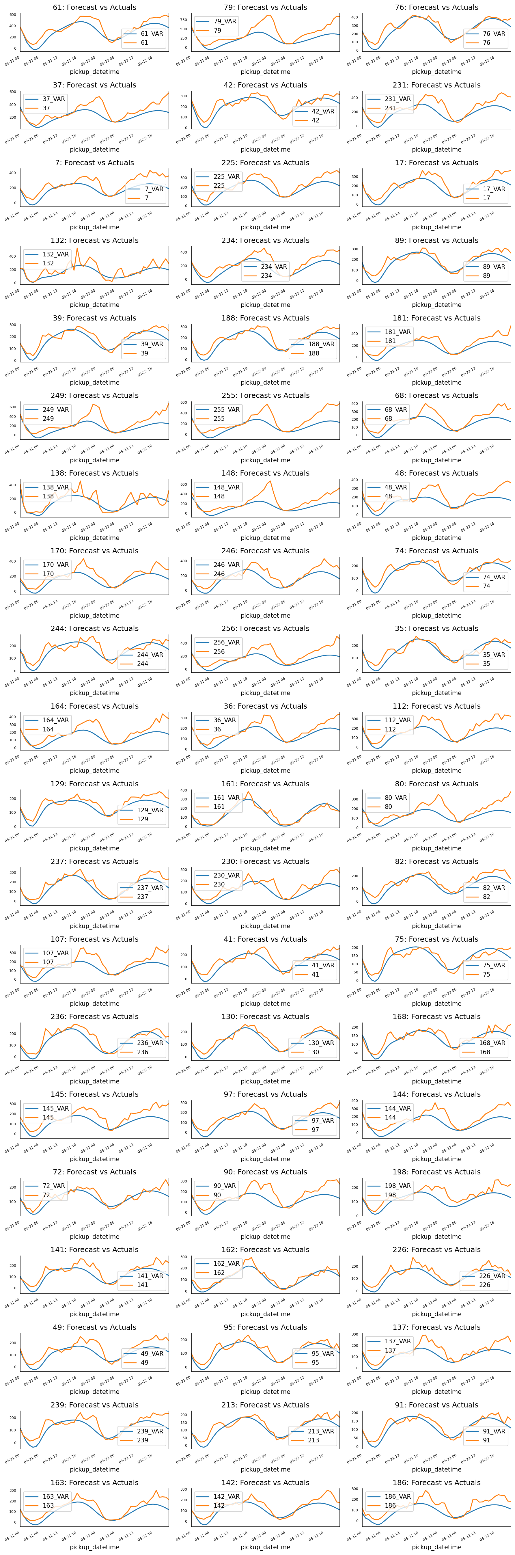
In the next step, we will train the VAR model with selected order (p=3) and use this model to predict the rideshare demand of all 61 taxi zones in the next 48 hours. The prediction results are shown in the figure below. From this figure, we can see that although quite simple, the VAR model can still provide pretty good results for all the taxi zones.
# Forecast VAR model using statsmodels
model_fitted = model.fit(3)

# Get the lag order
lag_order = model_fitted.k_ar

# Input data for forecasting
forecast_input = df_train.values[-lag_order:]

# Forecast
nobs = 48
fc = model_fitted.forecast(y=forecast_input, steps=nobs)
df_forecast = pd.DataFrame(fc, index=df_test.index[:nobs], columns=df_test.columns + '_VAR')
# Plot of Forecast vs Actuals
fig, axes = plt.subplots(nrows=int(len(df_test.columns)/3), ncols=3, dpi=150, figsize=(12,36))
for i, (col,ax) in enumerate(zip(df_test.columns, axes.flatten())):
    df_forecast[col+'_VAR'].plot(legend=True, ax=ax).autoscale(axis='x',tight=True)
    df_test[col][:nobs].plot(legend=True, ax=ax);
    ax.set_title(col + ": Forecast vs Actuals")
    ax.xaxis.set_ticks_position('none')
    ax.yaxis.set_ticks_position('none')
    ax.spines["top"].set_alpha(0)
    ax.tick_params(labelsize=6)
plt.tight_layout();
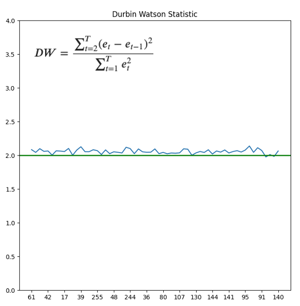
Finally check for Serial Correlation of Residuals (Errors) using Durbin Watson Statistic Ref. Here the serial correlation of residuals is used to check if there is any leftover pattern in the residuals (errors). The value of this statistic can vary between 0 and 4. The closer it is to the value 2, then there is no significant serial correlation. The closer to 0, there is a positive serial correlation, and the closer it is to 4 implies negative serial correlation. As shown in the figure below, for all taxi zones the Durbin Watson Statistic is very close to 2, so there is minimal leftover pattern in the residuals.
out = durbin_watson(model_fitted.resid)
dw = pd.concat([pd.DataFrame(df.columns), pd.DataFrame(out)], axis=1)
dw.columns = ['PULocationID', 'durbin_watson']
fig,ax=plt.subplots(1,1, figsize=(8,8))
ax.plot(dw.PULocationID, dw.durbin_watson, label = "train_loss")
ax.set_ylim(0, 4)
ax.axhline(2, color ='green', lw = 2)
myLocator = mticker.MultipleLocator(4)
ax.xaxis.set_major_locator(myLocator)
ax.set_title('Durbin Watson Statistic')
5.4. Recurrent Neural Network (RNN)
Finally we will use the Recurrent Neural Network (RNN) to predict the rideshare demands of 61 taxi zones simultaneously. To enable a side by side comparison with predictions from VAR model from the previous section, we will use the same test data range as before. On the other hand, since the RNN model does not require stationarity, we will usee all the previous data as training and evaluation set.
As shown in the code block below, the model is quite simple, containing two RNN layers and a full connection layer. The data is standardized first, and we will use last 24 hours of rideshare demand to predict the demand of next hour for each taxi zone.
train_mean = agg_df_sub_train.mean()
train_std = agg_df_sub_train.std()
agg_df_sub_train_norm = (agg_df_sub_train-train_mean)/train_std
agg_df_sub_val_norm = (agg_df_sub_val-train_mean)/train_std
agg_df_sub_test_norm = (agg_df_sub_test-train_mean)/train_std

def df_to_X_y2(df, window_size=5):
  df_as_np = df.to_numpy()
  X = []
  y = []
  for i in range(len(df_as_np)-window_size):
    row = [a for a in df_as_np[i:i+window_size]]
    X.append(row)
    label = df_as_np[i+window_size]
    # label = df_as_np[i+window_size][:-4]
    y.append(label)
  return np.array(X), np.array(y)

WINDOW_SIZE = 24
X_train1, y_train1 = df_to_X_y2(agg_df_sub_train_norm, WINDOW_SIZE)
X_val1, y_val1 = df_to_X_y2(agg_df_sub_val_norm, WINDOW_SIZE)
X_test1, y_test1 = df_to_X_y2(agg_df_sub_test_norm, WINDOW_SIZE)
X_train1.shape, y_train1.shape, X_val1.shape, y_val1.shape, X_test1.shape, y_test1.shape

model1 = Sequential()
model1.add(InputLayer((24, 61)))
model1.add(SimpleRNN(40, return_sequences=True))
model1.add(SimpleRNN(40))
model1.add(Dense(61, 'linear'))
model1.summary()
# Output
Model: "sequential_1"
_________________________________________________________________
 Layer (type)                Output Shape              Param #
=================================================================
 simple_rnn_2 (SimpleRNN)    (None, 24, 40)            4080
 simple_rnn_3 (SimpleRNN)    (None, 40)                3240
 dense_1 (Dense)             (None, 61)                2501
=================================================================
Total params: 9821 (38.36 KB)
Trainable params: 9821 (38.36 KB)
Non-trainable params: 0 (0.00 Byte)
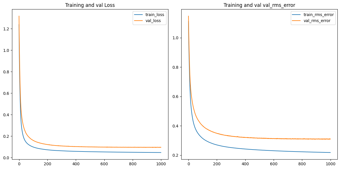
The code block below shows that the model is optimized by Adam algorithm with learning rate set to 0.0001. We trained the model for 1000 epoches, and as can be seen from the figure below, after 1000 epoches, both the training and validation loss are plateaued.
cp1 = ModelCheckpoint('P3_model_1/', save_best_only=True)
model1.compile(loss=MeanSquaredError(), optimizer=Adam(learning_rate=0.0001), metrics=[RootMeanSquaredError()])
history = model1.fit(X_train1, y_train1, validation_data=(X_val1, y_val1), epochs=1000, callbacks=[cp1], batch_size=100)
The figure below shows the predicted vs actual rideshare demand of each taxi zone for the first 48 hours of test set. This figure has exactly the same time range as the previous section. By comparing these two figures, we can clearly see that RNN produces significantly better prediction than VAR model.
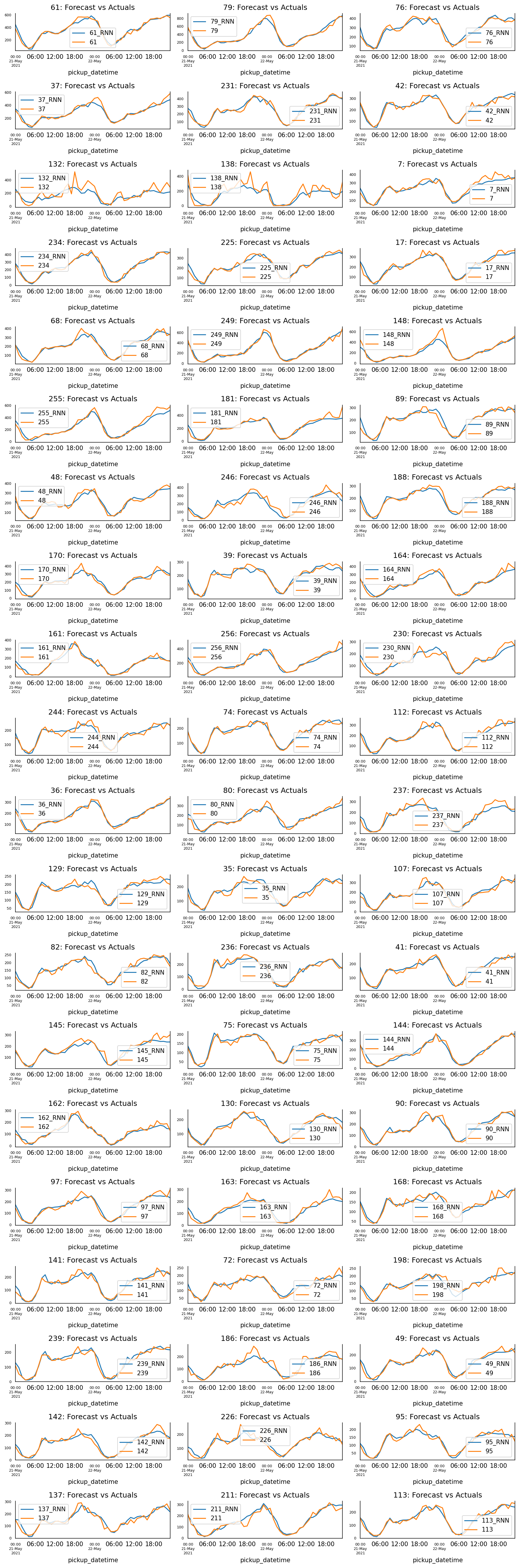
To quantify the difference of these two models (VAR and RNN), we have also computed a comprehensive set of metrics, including, Mean Absolute Percentage Error (MAPE), Mean Error (ME), Mean Absolute Error (MAE), Mean Percentage Error (MPE), Root Mean Square Error (RMSE), as well as corr and minmax.
def adjust(val, length= 6): return str(val).ljust(length)

def forecast_accuracy(forecast, actual):
    mape = np.mean(np.abs(forecast - actual)/np.abs(actual))  # MAPE
    me = np.mean(forecast - actual)             # ME
    mae = np.mean(np.abs(forecast - actual))    # MAE
    mpe = np.mean((forecast - actual)/actual)   # MPE
    rmse = np.mean((forecast - actual)**2)**.5  # RMSE
    corr = np.corrcoef(forecast, actual)[0,1]   # corr
    mins = np.amin(np.hstack([forecast[:,None],
                              actual[:,None]]), axis=1)
    maxs = np.amax(np.hstack([forecast[:,None],
                              actual[:,None]]), axis=1)
    minmax = 1 - np.mean(mins/maxs)             # minmax
    return({'mape':mape, 'me':me, 'mae': mae,
            'mpe': mpe, 'rmse':rmse, 'corr':corr, 'minmax':minmax})

nobs = 48
print('Forecast Accuracy of: 61')
accuracy_prod = forecast_accuracy(test_predictions2['61_RNN'][:nobs].values, agg_df_sub_test_w24['61'][:nobs])
for k, v in accuracy_prod.items():
    print(adjust(k), ': ', round(v,4))
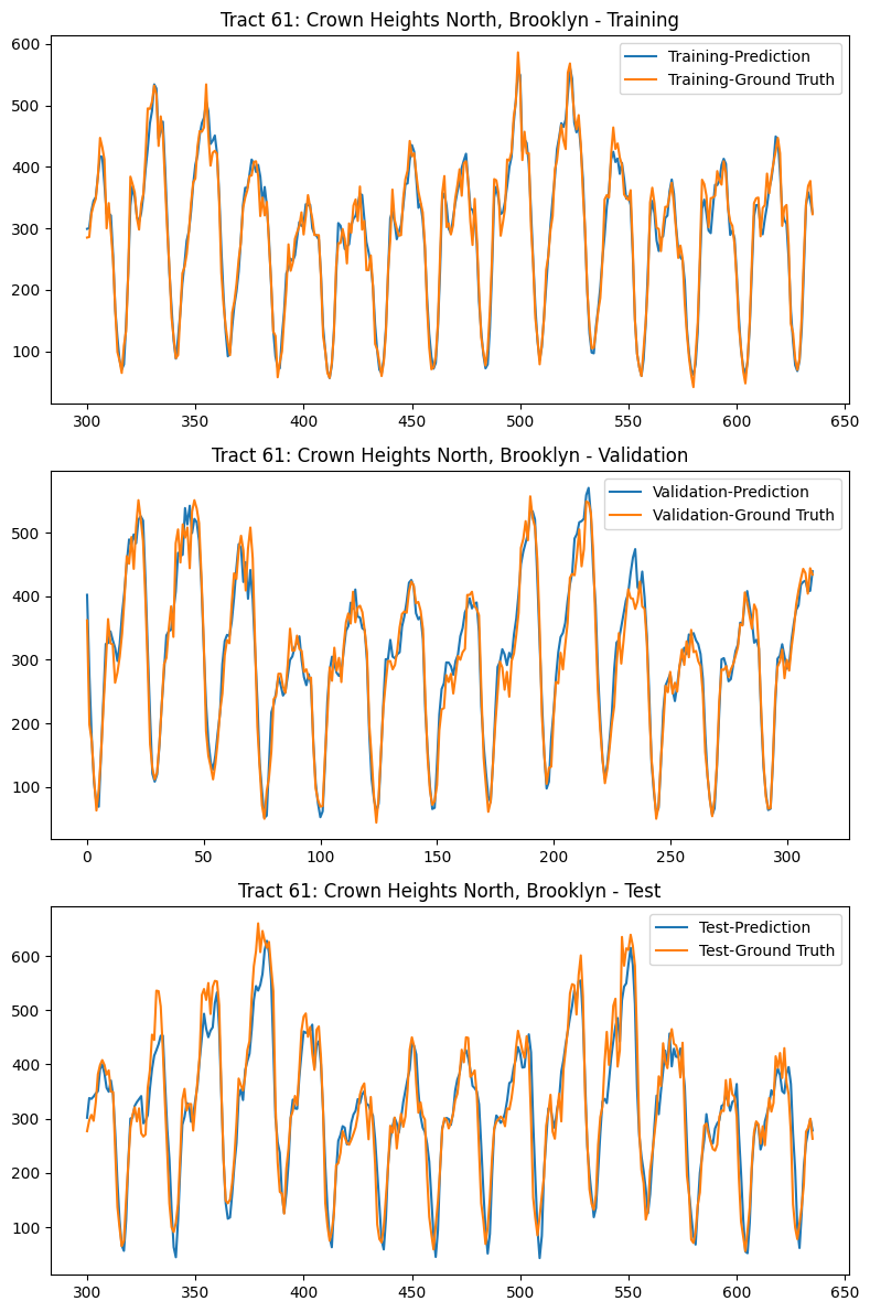
We will use Taxi Zone 61, which is the taxi zone with the highest rideshare demand, as an example, to further examine the performance of RNN model. The table below shows the metrics comparison of VAR vs RNN, and the figure below shows the comparison of RNN prediction vs. Ground Truth for Training set, Validation set, and Test set. From both table and figure, we can clearly see that RNN can capture hourly pattern and weekly pattern, and it has great accuracy.
Forecast Accuracy of: 61
            VAR         RNN
----------------------------------------
mape   :    0.2715      0.0918
me     :  -69.4922      1.6190
mae    :   79.3486     24.0960
mpe    :   -0.2217      0.0156
rmse   :   99.1222     31.4320
corr   :    0.8949      0.9803
minmax :    0.2666      0.0832
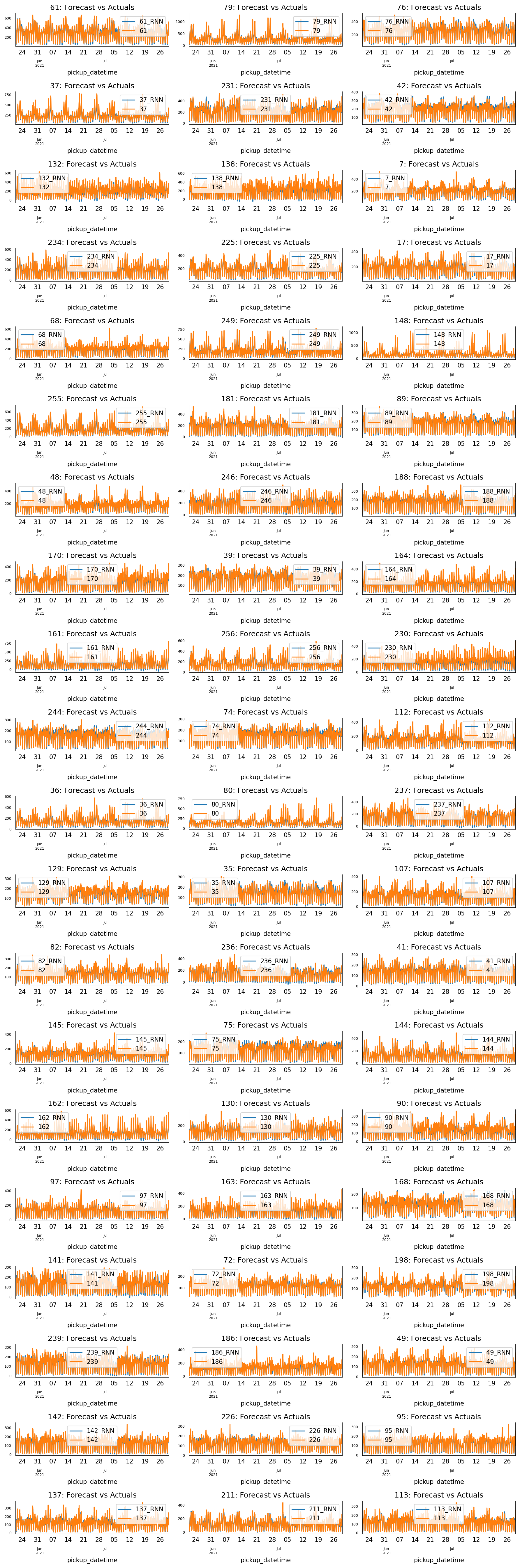
Finally, the figure below shows the RNN prediction vs. Ground Truth of each taxi zone for the full test data set. From this figure, we can see that RNN indeed has great prediction.
6. Conclusions
In this post, we have studied the rideshare demands in New York City. First, we conducted EDA and discovered some very interesting patterns within the data. Then we built a clustering model to cluster data and to gain a deeper understanding of how ridesharing is being used. Finally, we developed four machine learning models to predict rideshare utilization, including Seasonal Autoregressive Integrated Moving Average (SARIMA), Gaussian Process (GP), Vector Autoregression (VAR), and Recurrent Neural Network (RNN).